I was trying to build a responsive navigation system that incorporates a hamburger menu icon on mobile, whilst having text headers on desktop.
It wasn’t clear how to hide the icon element on desktop, whilst displaying it on mobile.
For me this raised a question: why is there not a drop-in pre-built navigation component? Or at least a tutorial on how to create this using the tool.
1 Like
Alex
March 31, 2025, 9:28am
2
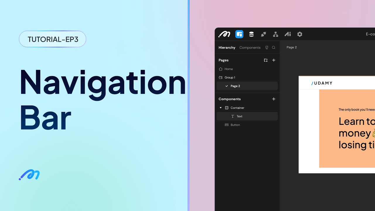
Hi, we have some tutorials covering how to build a navigation bar:
I hope this can help you. We’re making more tutorials about how to use Momen.
To hide a component at a specific breakpoint, select the component and turn on the Invisible switch in the right sidebar. You can find it under Design → Style .
1 Like
Alex
March 31, 2025, 9:41am
3
About the pre-built components, we’ll have a component marketplace in the near future, allowing users to upload their own components. Stay tuned!
1 Like

![How to build an online store with Momen [step-by-step guide]](https://forum-static.momen.app/original/1X/ee54be1768af3c9f2370ef15e2dea3cb6deccebe.jpeg)
