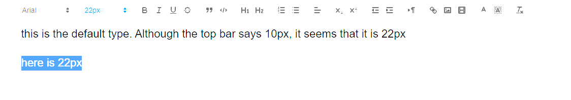
The default font size in my rich text editor displays 10px but letters I type appear to be 22px. I wondering if I am doing something wrong as far as settings or something.
Can we set the default type font and size for out app?
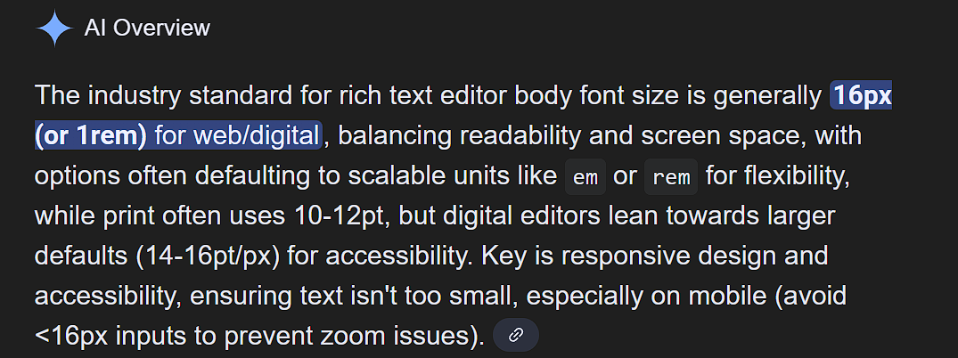
From the google:
The default font size in my rich text editor displays 10px but letters I type appear to be 22px. I wondering if I am doing something wrong as far as settings or something.
Can we set the default type font and size for out app?
From the google:
Currently no. Will be something that we work on next year.
is something y’all can easily reset, in your Momen code, the default font size to 16px instead of 22px?
Okay, I was trying to create a work around by setting the rich text editor font size by trying to use html
(can’t use brackets on this forum) p style= “font-size: 16px;”>
</p
I thought by setting the input on page load with this html would work but the rich text editor doesn’t seem to be an option.
So I was trying to set a delay on page load but I can’t find a way to essentially:
Trigger: Page Loaded → Delay (300ms) → Set Value (on Rich Text Editor)
Am I just wasting my time trying to figure out a work around or is this possible?
Default values should work.
Eric can you verify?
Hey @Eric - what’s the word?
There’s currently no way to change the default value. I’ll submit a feature request for you.
@Eric - thank you, much appreciated.
Isn’t there a way for y’all to go into your code base and change 22px to 16px?
This is not a perfect solution.
When you haven’t manually selected a piece of text and assigned it a custom size, the current default font sizes are as follows:
desktop: 22px
tablet: 20px
mobile: 18px
Without assigning sizes to selected text, I believe there isn’t an official method to set a custom default text size for the rich text display element.
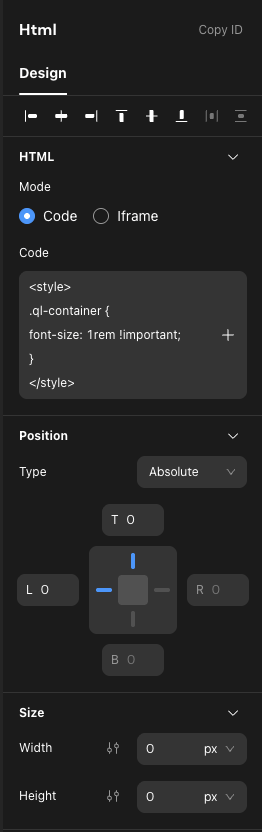
However, since you’re already using raw HTML and CSS, you can add an HTML element with absolute positioning and 0 x 0 size at the root. This will not interfere with other elements.
Use the following code to style all rich text elements on the entire page across all screen sizes:
<style>
  .ql-container {
    font-size: 1rem !important;
  }
</style>
If you want different sizes for various breakpoints, you can use the following CSS:
@media screen and (max-width: 610px) {
  .ql-container {
    font-size: 0.875rem !important;
  }
}
@media screen and (min-width: 611px) and (max-width: 1200px) {
  .ql-container {
    font-size: 0.9375rem !important;
  }
}
@media screen and (min-width: 1201px) {
  .ql-container {
    font-size: 1rem !important;
  }
}
That solves my problem !
Thank you  Thank you Thank you